Display View and View Types
Several layouts can be created on the display window. To add a new layout click in the ![]() icon on top of the display view (see the red arrow in the picture below). This will create a new layout for which any specific type of view can be selected from the Create View list. The most common used views are indicated by green arrows in the picture below and described here.
icon on top of the display view (see the red arrow in the picture below). This will create a new layout for which any specific type of view can be selected from the Create View list. The most common used views are indicated by green arrows in the picture below and described here.
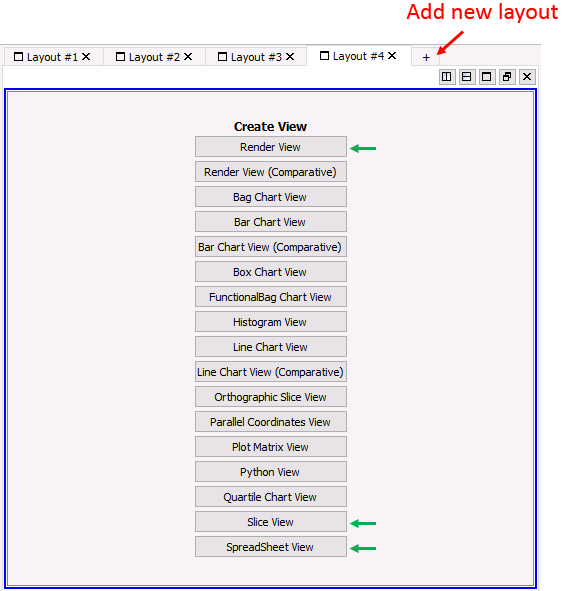
Display View on adding a new layout
The render view allows visualization of contour plots of the data. To choose the state variable to be plotted select it from the drop down menu pointed by the red arrow in the picture below. Variables with a ![]() icon are element variables whereas variables with a
icon are element variables whereas variables with a ![]() icon are nodal values or averaged nodal values of element variables. The render type can be selected in the drop down menu pointed by the green arrow. Most common choices are:
icon are nodal values or averaged nodal values of element variables. The render type can be selected in the drop down menu pointed by the green arrow. Most common choices are:
1.Surface: Contour plot
2.Surface with edges: Contour plot with element edges displayed in a default solid colour
3.Wireframe: Only element wedges are displayed which can be coloured according to the colour scale map.
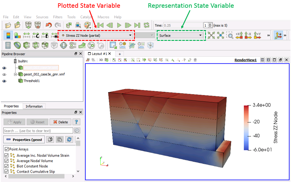
Render View
Contours: Color scale, range, etc.
The ![]() icon in the task bar allows customization of the range of the colour scale by defining the minimum and maximum values for the scale.
icon in the task bar allows customization of the range of the colour scale by defining the minimum and maximum values for the scale.
The ![]() rescales to the default colour scale.
rescales to the default colour scale.
The ![]() icon allows changing the colour scale style and choose one of the available presets, customize it, change legend appearance, etc.
icon allows changing the colour scale style and choose one of the available presets, customize it, change legend appearance, etc.
When the ![]() icon is clicked the colour map editor window shows up (see picture below). The colour mapping is edited by selecting and editing existing mapping points (highlighted by yellow arrows in the picture below) or by inserting new mapping points by clicking with the mouse on any location in the mapping colour bar. Once a mapping point is selected it can be either dragged with the mouse or type in a data value in the data box (pointed by a black arrow in the picture below). With this operation the colour for that mapping point will be assigned to a different data value and colours with adjacent mapping points will be interpolated (see the example in the picture below).
icon is clicked the colour map editor window shows up (see picture below). The colour mapping is edited by selecting and editing existing mapping points (highlighted by yellow arrows in the picture below) or by inserting new mapping points by clicking with the mouse on any location in the mapping colour bar. Once a mapping point is selected it can be either dragged with the mouse or type in a data value in the data box (pointed by a black arrow in the picture below). With this operation the colour for that mapping point will be assigned to a different data value and colours with adjacent mapping points will be interpolated (see the example in the picture below).
The ![]() icon saves the edited color map into a new preset.
icon saves the edited color map into a new preset.
The ![]() icon allows selection of a new preset color scale.
icon allows selection of a new preset color scale.
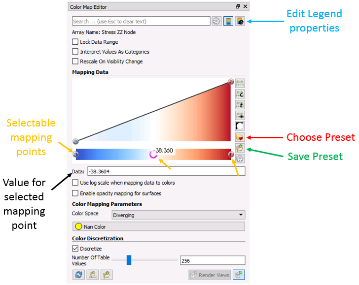
Color Map Editor window
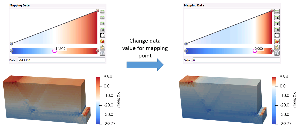
Example of edit in the colour scale mapping points
Zoom, camera, customize camera, etc.
In render view the camera can be controlled with the mouse. In 3D problems the default controls are as follows:
•Left mouse click + Drag: Applies a "free" rotation to the model to the dragged direction. It is possible to constrain the rotation axis to X, Y or Z by keeping pressed the X, Y or Z keyboard keys respectively while dragging the mouse.
•Right mouse click + Drag / Mouse wheel roll: Zoom In/Zoom Out.
•Mouse wheel click + Drag or Shift key + Right mouse click + Drag: Change camera position (translate the model).
The following icons from the task bar allow Zoom operations (e.g. center zoom to visible datasets), to set the camera perpendicular to one of the X, Y and Z axis or manipulate the center of rotation which affects the behaviour of the camera when controlled by the mouse.
![]()
Camera buttons in the task bar
Customized camera positions can be saved by:
1.Adjust the camera position to a position to be saved.
2.Click on the ![]() icon on the top left corner of the display window. The "Adjust Camera" window will pop up.
icon on the top left corner of the display window. The "Adjust Camera" window will pop up.
3.Click on ![]() . This will make the "Configure custom view buttons" window to pop up.
. This will make the "Configure custom view buttons" window to pop up.
4.We have 4 slots available to save 4 different custom views (camera positions). To save the current view first type in a name for the view in the "Tool Tip" box. In the picture below we have written Tutorial Camera 1 in the first slot.
5.Then click on ![]() button next to the first slot. This will save the current view and associate it with button 1. Then click on
button next to the first slot. This will save the current view and associate it with button 1. Then click on ![]() .
.
6.If the camera is subsequently moved, to return to the saved view click on the ![]() icon on the top left corner of the display window and then click on the
icon on the top left corner of the display window and then click on the ![]() icon from the "Adjust Camera" window.
icon from the "Adjust Camera" window.
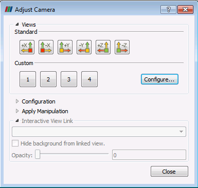
Adjust camera window
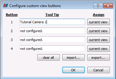
Configure custom view buttons window
The Slice View is similar to the Render View but instead shows three perpendicular slices of the model aligned with the three principal axis X, Y and Z. To change the location of the slices drag the arrows in each axis shown in the red boxes in the picture below.
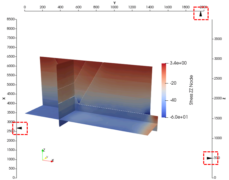
Slice View Example
The Spreadsheet View allows visualization of the state data values in a spreadsheet.
The "Showing" drop down menu (green box in the picture below) we can select any dataset from the Pipeline.
The "Attribute" drop down menu (red box in the picture below) allows selection of visualization of element or nodal data.
Note that in order to visualize variables in the spreadsheet the dataset must contain group data only (no contact of well data). If the problem contains contact data the "Extract Block" filter can be used to deactivate all contact surfaces or wells.
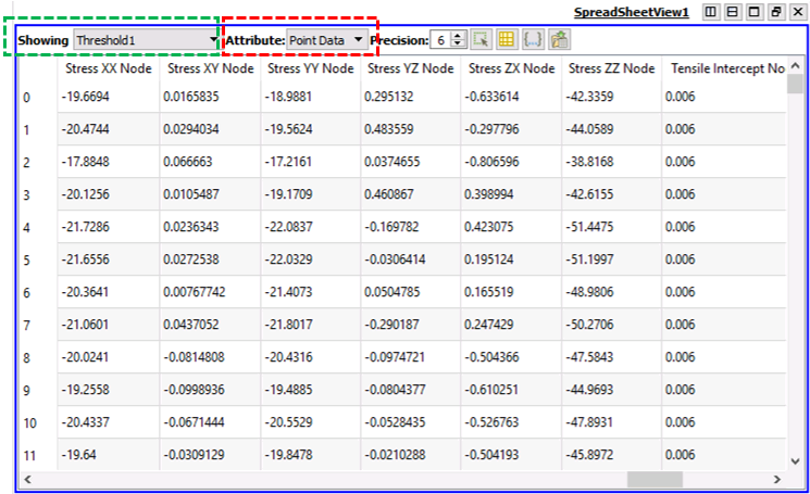
Spread Sheet View
The Display Screen can be split to have multiple views/multiple view types or even different dataset views on the screen. The icons controlling views are located on the top right of the display view and are:
• ![]() Split Screen vertically / horizontally
Split Screen vertically / horizontally
•![]() Maximize the selected view
Maximize the selected view
•![]() Restore the split view after a selected view has been maximized
Restore the split view after a selected view has been maximized
•![]() Deletes the selected view from the multiple split views
Deletes the selected view from the multiple split views
Note that after the display view is split, the split icons appear at the top right of each the view windows
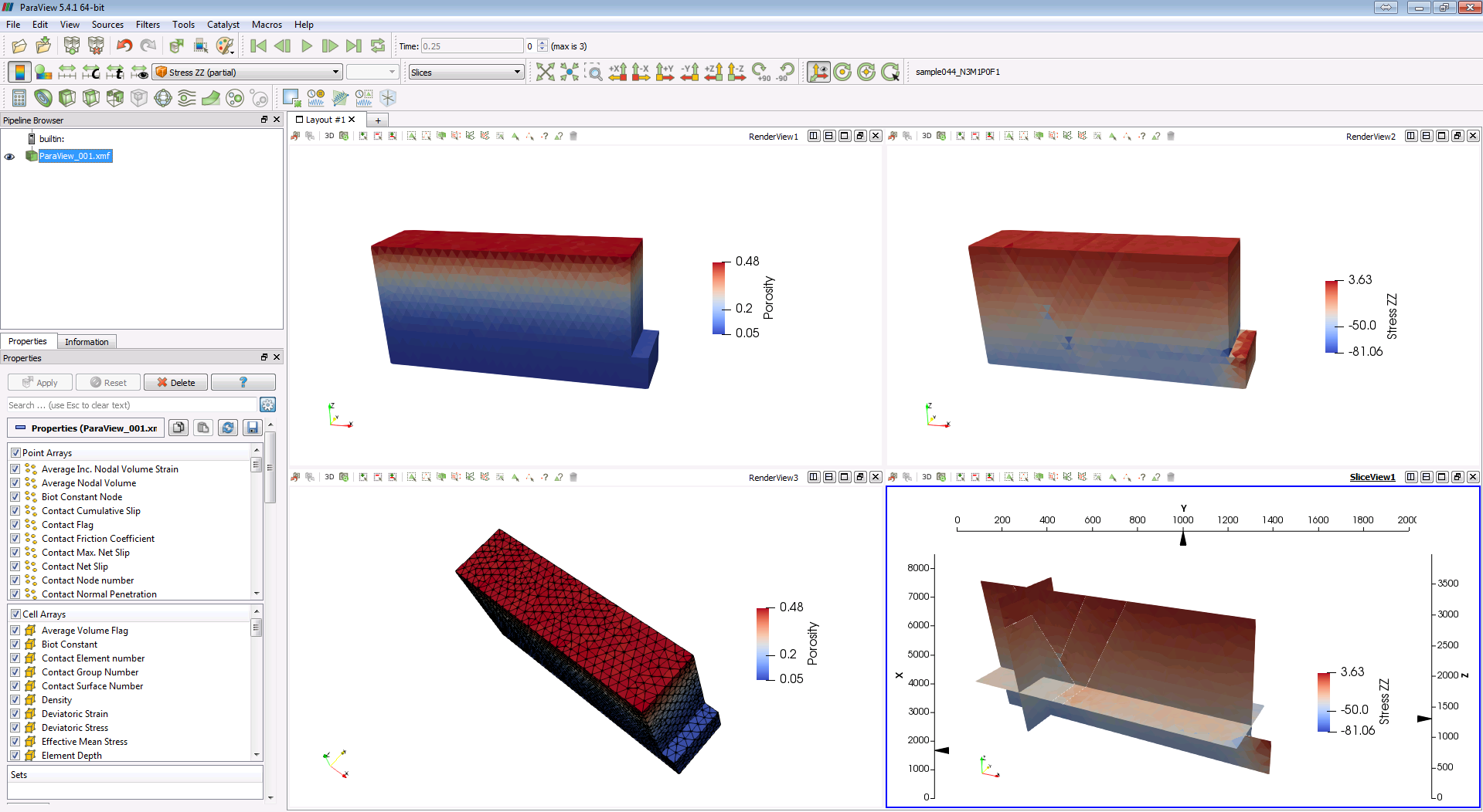
Example of a split Display Screen in Paraview
