Quick Example Tutorial
Here a quick tutorial showing how to load and perform basic processing operations on a typical 3D MEM step by step is presented. These operations include:
1 - Open plot files
2 - Calculating averaged nodal data from element data
3 - Calculate derived variables from existing variables
4 - Extract Block filter to activate/deactivate group (formation) data
5 - Visualize contact data
6 - Map and visualize data to a well path
The tutorial example uses files provided in ParaView_001\Results folder. This contains result data from the 3D graben example shown in Geost_002_case3 tutorial chapter.
In order to open plot files:
1.Either go to File/Open and then browse for the plot file(s), or drag and drop the plot file from its container folder to the ParaView window. For this tutorial the ParaView_001.xmf file must be opened.
2.Then the "Open Data With..." window will pop-up and we must select the Xdmf Reader option and click OK (see the picture below). Note that depending on the Operating System the options may be sorted in a different order.
3.The plot file name will then be shown in the Pipeline Browser and the Apply button should be clicked to visualize the plot file data. Note that the ![]() icon next to the file name in the Pipeline Browser indicates whether the data is visible (
icon next to the file name in the Pipeline Browser indicates whether the data is visible (![]() ) or hidden (
) or hidden (![]() ) and we may turn visibility ON/OFF by clicking on it.
) and we may turn visibility ON/OFF by clicking on it.
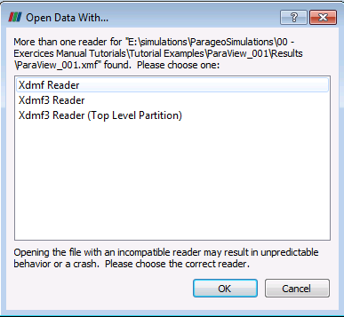
Open Data With... window
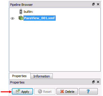
Pipeline browser
2 - Calculating averaged nodal data from element data
As a big 3D MEMs require a substantial amount of disk space usually only element data is output during simulation and element averaged nodal data is not output to save space. In ParaView we have an option to calculate nodal averaged values from element data. To do this:
1.Select the dataset containing the element data in the Pipeline Browser. In this case it is the ParaView_001.xmf dataset
2.Click on ParaView menu Filters/Alphabetical/Cell Data to Point Data
3.Click on ![]() button below the pipeline browser. A new dataset containing both element data and calculated nodal data will be displayed in the pipeline browser. Now we can select nodal data to be plotted in the variable selection drop down menu. Note that variables with
button below the pipeline browser. A new dataset containing both element data and calculated nodal data will be displayed in the pipeline browser. Now we can select nodal data to be plotted in the variable selection drop down menu. Note that variables with ![]() icon are element variables whereas variables with
icon are element variables whereas variables with ![]() icon are nodal averaged variables.
icon are nodal averaged variables.
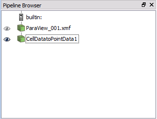
Pipeline Browser after applying the Cell to Point Data filter
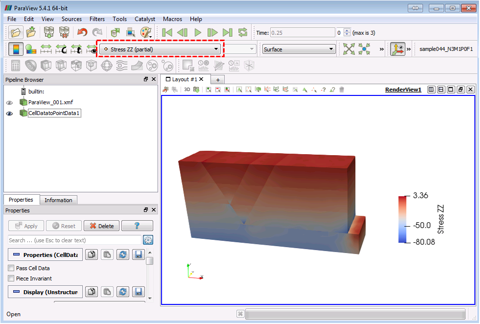
ParaView screen with selectable nodal data.
3 - Calculate derived variables from existing variables
In ParaView we can derive new variables from existing variables (e.g. Total Stress from Effective Stress and Pore Pressure, K ratios from Horizontal and Vertical Effective Stresses, etc). For example to compute the "Kx Ratio":
1.Select the dataset in the Pipeline Browser which contains the variable data we will use to calculate new derived variable. In this case we will use the CellDatatoPointData1 dataset created in the previous step which contains nodal and element data.
2.Click on the ![]() icon in the task bar or on Filters/Alphabetical/Calculator .
icon in the task bar or on Filters/Alphabetical/Calculator .
3.In the Calculator properties select either Point Data (nodes) or Cell Data (elements) from which we want to calculate the derived variable.
4.Write the name of the derived variable we want to calculate. After calculation this name will appear on the list of variables to plot and on the legend title. In this case we will write "K ratio".
5.Define the variable formula. We can use any of the operators shown. We may select any of the existing variables shown in the list from Scalars drop down menu. Alternatively we may type in directly the formula. In this case we will define "K ratio" as "Stress XX/Stress ZZ".
6.Click on ![]() . Note that it is common for an error message to pop up. Just ignore it and select the calculated variable from the variable list in ParaView's drop down menu.
. Note that it is common for an error message to pop up. Just ignore it and select the calculated variable from the variable list in ParaView's drop down menu.
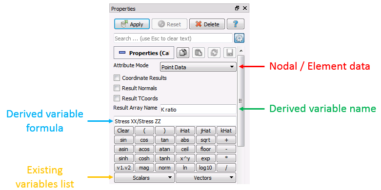
Calculator properties menu
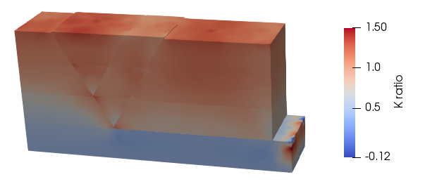
Calculated effective stress ratio values
4 - Extract Block filter to activate/deactivate group (formation) data
In order to select which formations we want visible we must:
1. Select the dataset we want to visualize blocks from in the Pipeline Browser. In this case we will use the Calculator1 created in the previous step.
2.Click in Filters/Alphabetical/Extract Block
3.On the properties menu below the Pipeline Browser we must select the data blocks that we wish to be visible. In the example below the filter is used to deactivate all contact data and formation 2 group data so that only group data for formations 0, 1 and 3 is plotted.
4. Click on ![]() .
.
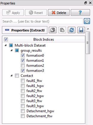
Extract Block filter properties menu
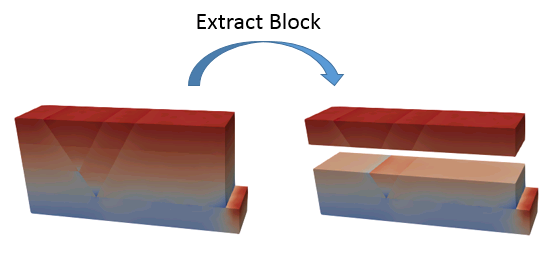
Data before (left) and after (right) Extract Block filter
The best way to visualize faults and contact data (specially in 3D problems) is to use the Extract Block filter to create a data set only containing contact surfaces or faults. To do so we have to:
1.Select the dataset from which we wish to extract contact data.
2.Click on Filters/Alphabetical/Extract Block.
3.Select all the contact surfaces we are interested to display and leave all remaining data unselected.
4.Click on ![]() . Now only contact surfaces are displayed. We can select to plot any contact variables.
. Now only contact surfaces are displayed. We can select to plot any contact variables.
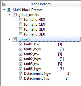
Extract Block filter properties menu
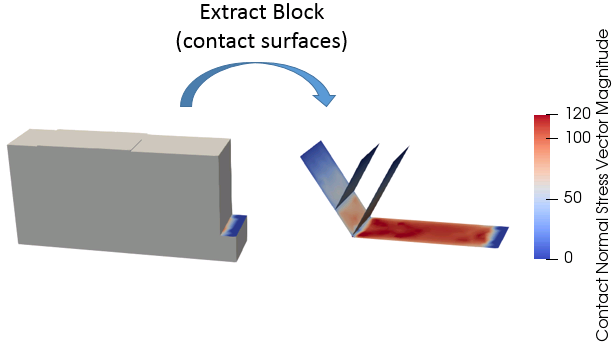
Plot before (left) and after (right) Extract Block filter to display only contact surfaces
We can offset the hanging wall and footwall contact surfaces by:
1.Select the dataset containing the extracted contact data from the Pipeline Browser (performed with the previous Extract Block filter).
2.Click on the ![]() icon in the task bar or Filters/Alphabetical/Warp by Vector.
icon in the task bar or Filters/Alphabetical/Warp by Vector.
3.In the properties window, in Vectors leave "Contact Normal Vector" selected. In Scale Factor we must write the distance we want to offset contact surfaces (a negative number will move them apart from each other). In this case we will write -200.
4.Click on ![]() . Now contact surfaces are separated a distance of 400 m from each other in the normal direction.
. Now contact surfaces are separated a distance of 400 m from each other in the normal direction.
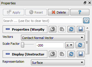
Warp by Vector filter properties menu
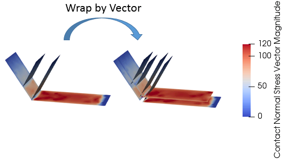
Plot before and after Warp by Vector filter.
We may plot contact stress vectors (or any type of contact vector) on top of the contact surfaces. To do this:
1.Select the dataset containing contact surface data in the Pipeline Browser ( in this case the WarpbyVector1).
2.Click on the ![]() icon on the task bar or Filters/Alphabetical/Glyph.
icon on the task bar or Filters/Alphabetical/Glyph.
3.In the Properties menu, in Vectors select "Contact Stress Vector"
4.In Scale Mode select "vector"
5.Write a Scale Factor. The size of the Glyph arrows will be scaled according that value
6.In Glyph mode select "All Points"
7.Click on ![]() . Now Glyph arrows representing magnitude (size) and direction of contact stress vector are displayed. The Glyph arrows may be coloured according to any contact variable.
. Now Glyph arrows representing magnitude (size) and direction of contact stress vector are displayed. The Glyph arrows may be coloured according to any contact variable.
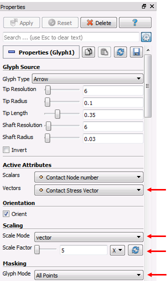
Glyph filter properties menu. The relevant options are pointed by red arrows.
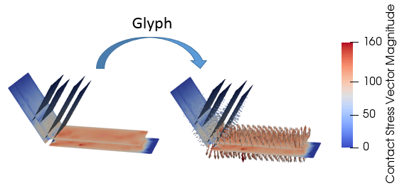
Plot before and after Glyph filter is applied
6 - Map and visualize data on a well path
CSV values defining well point coordinates can be imported and visualized for MEMs model results. In addition variables at the well points can be saved to a new CSV file. To import a well path:
1.We will delete all datasets except ParaView_001.xmf by selecting them and then do a Mouse Right Click and select ![]() .
.
2.We will apply an Extract Block filter dataset to create a new dataset containing only group data (no contact data).
3.Click on File/Open and select the CSV file containing the well coordinates. In this case we will use the provided ParaView_001 Well Coordinates.csv file.
4.Click on ![]() leaving the default properties options. A new Spreadsheet display window will open showing the well coordinates. This window is not required and can be deleted by clicking on the
leaving the default properties options. A new Spreadsheet display window will open showing the well coordinates. This window is not required and can be deleted by clicking on the ![]() icon on the top-right corner of the display window.
icon on the top-right corner of the display window.
5.With the ParaView_001 Well Coordinates.csv selected in the Pipeline Browser click on Filters/Alphabetical/Table to Points.
6.On the Properties select the appropriate headers corresponding to columns containing the X, Y and Z well coordinates (in this case they are also named X, Y and Z respectively).
7.Click on the ![]() . Now points may be visualized in the display window. By default the points are colored in white. Therefore to facilitate well point visualization; (a) select the "TableToPoints1" dataset in the Pipeline Browser; (b) click on the
. Now points may be visualized in the display window. By default the points are colored in white. Therefore to facilitate well point visualization; (a) select the "TableToPoints1" dataset in the Pipeline Browser; (b) click on the ![]() icon from the task bar; (c) select a non-white colour (e.g. red), (d) Turn OFF visualization of the Extract Block filter dataset in the pipeline browser and the well points will be easily viewed.
icon from the task bar; (c) select a non-white colour (e.g. red), (d) Turn OFF visualization of the Extract Block filter dataset in the pipeline browser and the well points will be easily viewed.
8.The thickness of the well path lines may be increased by; (a) selecting "TableToPoints1" dataset in the Pipeline Browser; (b) Changing the render type to "Points" on the Task Bar; (c) changing the line width in the Properties window.
9.In addition to facilitate visualization of the relative position of the well points to the model geometry we may load the ParaView_001_gmr.xmf geometry file and then perform an Extract Block filter leaving selected geometry/lines visible. This will show the geometry lines of the model (change their colour to black as it is white by default).
10.Select Filters/Alphabetical/Resample with Dataset.
11.The Change Input dialog window will pop up. Select "ExtractBlock1" dataset (dataset containing group data) as an input. Then click "Source" and select "TableToPoints1" dataset as the source.
12. Click on ![]() . The "ResampleWithDataset1" dataset is created. Now we can choose any variable to be displayed on the well points.
. The "ResampleWithDataset1" dataset is created. Now we can choose any variable to be displayed on the well points.
13. For better visualization in the ResampleWithDataset1 properties we may increase the point size.
14. We may save the well data in a CSV file. To do that select the ResampleWithDataset1 dataset and then click on File/Save Data (Ctrl+S) and save a new CSV.
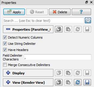
Load CSV file options
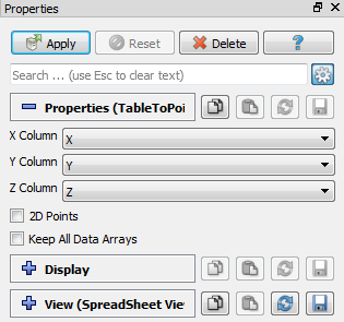
Table to Points options
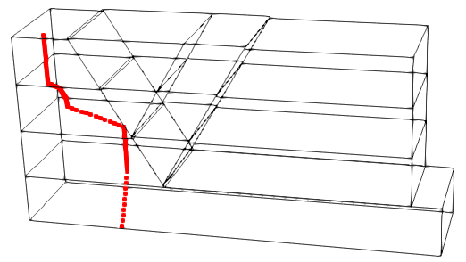
Model geometry lines with well points in red.
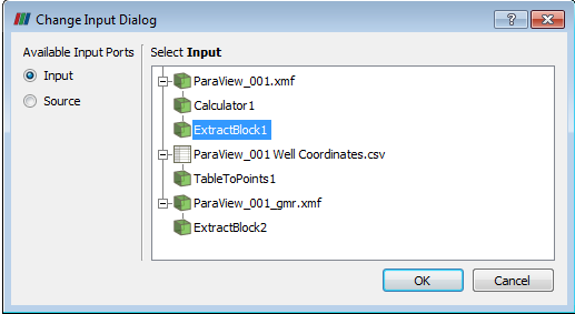
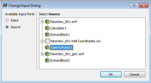
Input and Source selection for Resample with Dataset filter
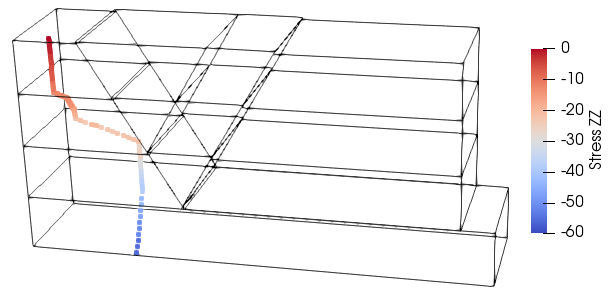
Well data showing Vertical Effective Stress (Stress ZZ)
